Showing posts with label web design. Show all posts

Wednesday, 31 August 2011

Characteristics of a modern portfolio site


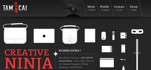
An extensive and excellent collection of portfolio sites, mainly for designers and developers. Still, food for inspiration...

Of all of the types of websites, the portfolio site has to overcome what might be some of the most difficult hurdles. Talk to almost any designer and they will agree, launching your own portfolio site is a painful process. Most frequently, this process includes numerous versions and, often times, a launch out of sheer frustration.

Full article : Characteristics of a modern portfolio site | Webdesigner Depot.

Thursday, 18 August 2011

Designing UX Exchange


An excellent case study of designing for the Web. Most often web designs start with a let's-make-something-pretty concept instead of first realizing what is the content, the desired features and which are the user actions we want to "provoke", and the developing a design to accommodate these elements.


UX Exchange is a Q&A site in the Stack Exchange SE family of websites, the most famous of which you probably know: Stack Overflow. Every SE site has its own look and feel, and as the UX site is getting close to graduating from beta, a new design was in order.

Full article: Designing UX Exchange.

Tuesday, 12 July 2011

Redesigning TechCrunch: We Picked This Logo Just to Piss You Off

Not sure what to think on the TechCrunch re-design yet, but it certainly loads faster (I had stopped visiting the last few months due to it's slowness)

The new logo is our most controversial change. I love it, though that’s no accident: we went through many, many options with Code & Theory before finding one we liked. It’s bold, simple, and versatile. It works in any context — from a tiny monochrome icon to a mosaic on a poster. It fits the TechCrunch brand perfectly. And no, we didn’t build it in Minecraft. We used AOL Paint, which comes free on the AOL CD and has this sweet UltraLogoMatic2000 feature.
The overall look & feel reflects the bold, sometimes irreverent nature of TechCrunch. It doesn’t hold tea parties in the backyard or hang out with the black turtleneck crowd at the hippest art galleries. It’s a design that breaks more news than its competitors, that loves the code junkies working 22-hour days to build world-changing products. It’s the first and only design Heather, Mike and I looked at and said yeah, that’s it. It screams TechCrunch.

More: Redesigning TechCrunch: We Picked This Logo Just to Piss You Off | TechCrunch.

Friday, 8 July 2011

25 Examples of Inspiring Product Display in Web Design


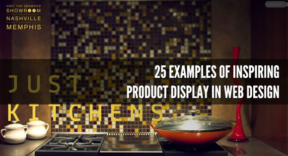
Choosing the best way to display products is a really important step of web design, since the way you display your products can drive attention to it and make users interested in what you are selling, or can drive users away. It’s like when you are walking in a mall, the most creative, elegant or stylish window displays will get your attention while super colorful and busy ones will drive you away.

Full article: 25 Examples of Inspiring Product Display in Web Design | Codrops