Reshared post from +Timothy Lorens
http://asterclick.drclue.net/snapshots/AsterClickHUD082510.png
Perfect example of way you don't let a geek design UI

Google+: Reshared 1 times
Google+: View post on Google+
http://asterclick.drclue.net/snapshots/AsterClickHUD082510.png
Perfect example of way you don't let a geek design UI

Google+: Reshared 1 times
Google+: View post on Google+
Embedded Link

Google+: View post on Google+

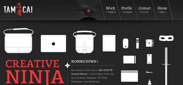
Of all of the types of websites, the portfolio site has to overcome what might be some of the most difficult hurdles. Talk to almost any designer and they will agree, launching your own portfolio site is a painful process. Most frequently, this process includes numerous versions and, often times, a launch out of sheer frustration.
A look at Diffbot, a visually learning robot
(As used in AOL's Editions, look at how the technology works).
Many of us use RSS feeds to get updates from our favorite news sites or blogs; however, RSS is only available on a very small portion of the Internet. Michael Tung, CEO of Diffbot, ran into this problem while trying to stay on top of class web pages while a student at Stanford. Since the sites didn’t have RSS, he developed a unique algorithm that found updates by looking at the visual layout of the page, as opposed to the HTML. After refining the program over the last two years, Diffbot has released an API that has allowed developers to accomplish some fascinating things with this technology.
“We provide technology that allows applications to interpret web pages like a human being,” explains Tung. “We’ve discovered that the entire Internet can be classified into about 30 different page types. What that means is that even though there’s essentially an infinite number of web pages on the web, there are certain common layouts and ways humans structure web pages that are understandable.”
Rather than looking at the tags or markup within a page, Diffbot looks at things like the X and Y coordinates for different parts of a page, the amount of screen real estate that each part is given, how a certain part is positioned relative to everything else on the page, and what kind of fonts and borders are used. Diffbot is developing an API for each type of page and currently has APIs available for both front pages and article pages.
“Developers are always trying to use web data, for example,” says Tung. “That’s why geeks like us created things like RSS and ways of syndicating data, essentially creating this machine-readable layer of the Internet. But as we’ve seen, adoption of those semantic formats, Open Graph for example, has never really taken off because there’s a chicken and egg problem. What we hope to do is create artificial intelligence software that can automatically understand what’s the layout versus what’s the actual information and extract that automatically without humans having to create those annotations themselves.”
Hundreds of developers are already building apps on top of the available APIs. For example, one developer built a radio station powered by Diffbot. The developer’s father is blind, which can make it extremely difficult to use the web, even with a screen reader. So the developer created Hacker News Radio, which pulls in a Hacker News RSS feed, passes the articles through the Diffbot API to get the actual text, and then sends the text through text-to-speech engines so it can be heard.
“It’s really, really simple,” explains Tung. “You just pass in a URL, you pass in your developer token and you get back a JSON that has all these fields in it. For the article API, those fields would be the title, who the author is…[and] the text.” Diffbot can even recognize if an article has multiple pages, so it’s sure to pick up the entirety of the text.
More info:
Diffbot web site: http://www.diffbot.com/
Diffbot blog: http://www.diffbot.com/blog
Diffbot profile on CrunchBase: http://www.crunchbase.com/company/diffbot
Google+: View post on Google+
Embedded Link

Google+: View post on Google+

Google+: Reshared 6 times
Google+: View post on Google+
Embedded Link

Google+: View post on Google+

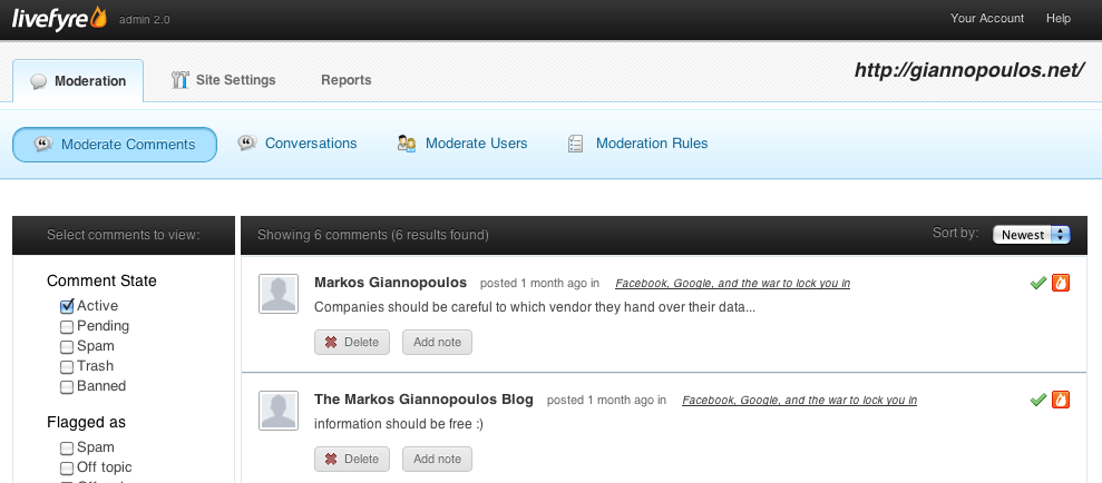
 Note #1: Cross-posting to Facebook isn't very sexy as the actual comment is not shown on Facebook but rather a "I posted a comment" message which will not bring many clicks.
Embedded Link

Google+: View post on Google+
Embedded Link

Google+: View post on Google+

Google+: View post on Google+
Embedded Link

Google+: View post on Google+
Embedded Link
Google+: View post on Google+
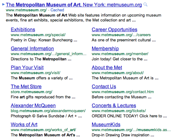
 Google is changing Sitelinks, the links below a search result with access to other pages of the same site.
Google+: View post on Google+
Embedded Link

Google+: View post on Google+
Embedded Link

Google+: View post on Google+
When it’s live: Just +1 a page as usual and look for the new “Share on Google+” option. From there you can comment, choose a circle and share. It’s very similar to the Facebook Recommend button, but it’s all about bringing fresh content to your Circles not your Newsfeed.
When you share content from the +1 button, you’ll notice that Google automatically includes a link, an image and a description in the sharebox. Google is calling these “+snippets,” and they’re very similar to “comments” in Facebook’s Recommend feature
The bit that gave me the lulz is the "upgrade" of try/catch/die to would_you_mind/actually_i_do_mind/cheerio.
Embedded Link
Google+: View post on Google+
Embedded Link

Google+: View post on Google+
Kudos to Dan Zarrella for creative marketing of his new book - you can download the Kindle version on Amazon completely FREE this week. Dan's book has been the top ebook in the world for the past 3 days. Amazing!
Zarrella's Hierarchy of Contagiousness: The Science, Design, and Engineering of Contagious Ideas published by +Seth Godin's The Domino Project.
Brilliant. Dan is HubSpot's Social Scientist and his content always rocks. This 80-page ebook reveals Dan's research on how to maximize social media, best times to post content, best words to use, who to tweet to and more. Packed with stats, metrics, and charts. Two thumbs way up! :) (Oh, and love the bunny cover!)
Embedded Link

Google+: View post on Google+
Embedded Link
Google+: View post on Google+

Can playing with Lego help you design better websites? A new, entirely serious, document from a Swiss team claims it can. URL – User Requirements with Lego is a process that creative teams can go through to help work out the best ways of communicating online.
Why Lego? Apparently because it’s simple to use; is known by most people; offers shapes and colours to aid with inspiration; can be built into simple or complex forms and is used in many different cultures. The process is based on an official Lego initiative called Serious Play, which looks to get all kinds of businesses using Lego to enhance their innovation and performance.
 Update: Apparently Playmobil already is in use outside of children's rooms. In Afghanistan, German police officers are training their Afghan colleagues using Playmobil. :)
Here's a collection of the graphs, frameworks and charts from 2 years of research at Altimeter Group. Had a lot of help from the talented +Christine Tran and +Andrew Jones
http://www.flickr.com/photos/jeremiah_owyang/sets/72157623558763750/with/4796442066/
Embedded Link

Google+: View post on Google+
http://www.adweek.com/adfreak/10-great-magazine-ads-dont-just-sit-there-looking-pretty-132401
Embedded Link

Google+: View post on Google+
Embedded Link

Google+: View post on Google+

Good visual design offers more than improving people’s attitudes to a design. Good visual design will actually make interfaces easier to use.
There are at least four key principles of visual design that have an important impact on usability. These four principles — contrast, repetition, alignment and proximity — were originally given the engaging acronym CRAP by Robin Williams (the visual designer, not the comedian). You can exploit these four principles to make user interfaces both more attractive and easier to use.
Embedded Link

Google+: View post on Google+

Whether you’re organizing a trip overseas or a picnic at a local park, knowing the weather forecast is a crucial part of the planning process. Today, we’re adding a weather layer on Google Maps that displays current temps and conditions around the globe, and will hopefully make travel and activity planning easier.
Embedded Link

Google+: View post on Google+
Embedded Link
Google+: View post on Google+

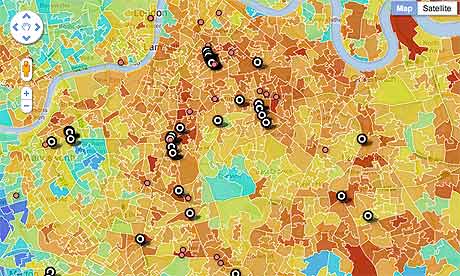
"These riots were not about poverty," said David Cameron yesterday. " That insults the millions of people who, whatever the hardship, would never dream of making others suffer like this."
But the question is: how do we know? If poverty affects health, education and crime, could it be a factor in the events of last week?
Here's a one-page scrolling view of Apple's advertisements from the late 70s until now. (http://bit.ly/pSZ8XA ) It's pretty interesting to see how Apple ads started and ended up at the same place.
The very first ad shows the Apple in a very personal setting / evoking the feelings of family. Apple is just part of your peaceful domestic life. Doesn't that remind you of the latest Apple ad that suggests you'll do all the things you've always done in life, but they're made better with iPad?
Here's the 2011 Apple ad I'm referring to: http://bit.ly/qPyrJ5 And the text from the video: "We'll never stop sharing our memories, or getting lost in a good book, we'll aways cook dinner and cheer for our favorite team, we'll still go to meetings, make home movies, and learn new things. But how we do all this, will never be the same."
In between 1979 and 2011, Apple ads tried to convince us of a few things:
1) the utility of owning a personal computer -- are these things really useful?
2).using an Apple makes you a revolutionary / inventor (like Edison)
3) using an Apple means you're counter-culture (boo IBM! yay hippies!)
4) using an Apple marks you as different / individualistic
Remember that first Apple ad was before the IBM PC even existed, let alone a credible threat. Now Apple's just back to being that loving part of your family. Is this a sign that Apple is supremely confident again? Since Apple's on the rise, it doesn't need to advertise from the position of the underdog anymore. Apple is no longer the radical, revolutionary outsiders machine -- it's the dominant player. Just part of the family.
With a move towards software in the "cloud" the main reason to use a PC is declining (software). Most privileged kids will grow up with iPads & iPhones. For those that need a keyboard, they're more likely to use an Apple product instead of Windows based one. Or, perhaps, and Android based one... ? The real battle for the future of "computing" may be Android vs. iOS -- whether that war is on tablets, phones or lap/desktops.
It'll be fun to see if the next 30 years is a battle of advertising between Google & Apple, instead of Apple & "IBM/Windows". (Thanks +Bill Gross for posting this on Twitter this morning which got me to thinking about it.)
Embedded Link

Google+: View post on Google+

An excellent case study of designing for the Web. Most often web designs start with a let's-make-something-pretty concept instead of first realizing what is the content, the desired features and which are the user actions we want to "provoke", and the developing a design to accommodate these elements.
UX Exchange is a Q&A site in the Stack Exchange SE family of websites, the most famous of which you probably know: Stack Overflow. Every SE site has its own look and feel, and as the UX site is getting close to graduating from beta, a new design was in order.

Google+: View post on Google+
Embedded Link

Google+: View post on Google+
Embedded Link

Google+: View post on Google+

SEO. Just the mention of it will flood your Twitter stream with spam replies and start the “gurus” knocking at your inbox door. But really, SEO isn’t as big of a mystery as many would make it out to be. Oh sure, there are some hard and fast rules when it comes to the good versus the bad, but many of the important parts about SEO can simply be followed by writing good content.
Behind the videoconferencing technology of Google+ Hangouts
When you use a Google+ Hangout (the feature over to the right side of Google+ that lets you do a videoconference with up to nine other people) you are using video technology developed by http://vidyo.com
Here I meet the CEO, who shows me what they've been working on lately: even higher quality video telepresence services. Then we end up doing a Google Hangout so you can see the quality difference. Funny enough +Jason Calacanis showed up there.
Enterprises who are trying to use videoconferencing at work should check this out.
Google+: View post on Google+
Embedded Link

Google+: View post on Google+
Embedded Link

Google+: View post on Google+
Google+: Reshared 1 times
Google+: View post on Google+
Embedded Link
Google+: View post on Google+
11 ways Tech has made us lazy. I am guilty of everything I've listed in this article (seriously). I almost never leave my room. No joke.
Embedded Link

Google+: View post on Google+
Embedded Link

Google+: View post on Google+
Embedded Link

Google+: View post on Google+
Google announced this week that Google+ shares would start showing up in Google search results. Is this a game changer?
Obviously this could give Google+ the edge over Facebook -- websites would be incentivized to integrate +1 buttons more than Like buttons if they provided a boost in search results.
What's not to clear to me is the exact effect a +1 or a Google+ share has on search results -- I thought it would just provide the same results and append a friend's avatar if they had shared that link ... but some testing suggests that Google is actually rearranging search pages based on what your friends share.
Does anyone have insights into how Google+ is changing search results? What have you seen? And is this a BIG DEAL or not?
http://mashable.com/2011/08/12/google-plus-social-search/
Embedded Link

Google+: View post on Google+
Embedded Link

Google+: View post on Google+
Embedded Link

Google+: View post on Google+
Embedded Link

Google+: View post on Google+
There’s certainly no shortage of books on social media, social technologies and online communities that are invaluable reading for brands, marketers etc. But there are some excellent books on social media that actually have nothing to do with social media.

Google+: View post on Google+