Embedded Link
Email Intervention - Homepage
Make the switch
Google+: View post on Google+
Embedded Link

Google+: View post on Google+
Sorry all. There was a typo in the last bit of art I posted. Here it is again sans typo. :)
Looks like they're already spreading around though! lol

Google+: View post on Google+

Where equals (or close to equals) get together to interact.
On Facebook it 's like a school reunion or a family picnic or an office party. A loose social gathering with no specific interest focus.
On Twitter it looks more like a cocktail party. Lots of subgroups with specific interests. But however it looks, it is not a medium. It's a social gathering. To twist McLuhan, "The message is the medium." This is not a broadcast environment. People are not on Twitter for the content. It's all about the context. And the quality of the conversation is what reigns supreme. And here's the problem...
 [/caption]
They looked like Apple products. It looked like an Apple store. It had the classic Apple store winding staircase and weird upstairs sitting area. The employees were even wearing those blue t-shirts with the chunky Apple name tags around their necks... You have already guessed the punchline, of course: this was a total Apple store ripoff. A beautiful ripoff – a brilliant one – the best ripoff store we had ever seen (and we see them every day). But some things were just not right: the stairs were poorly made. The walls hadn’t been painted properly. Apple never writes “Apple Store” on it’s signs – it just puts up the glowing, iconic fruit...
What’s perhaps most interesting here, is that the PMS campaign was actually a relaunch of a fairly similar campaign that had run in 2005. In that instance, the ads drew some negative response and complaints, but crucially this was before the widespread penetration of social media that we have today. In essence, the reaction around both campaigns was the same, but because of social media, the ad campaign this time around had to be pulled, because the company had to be seen to react to everything that was so publicly visible. Was this necessarily the right decision to make though?
“You can expect to see a level of analytics and measurement that you’d typically find in Google products as well as a nuanced approach to how things are shared. It encourages and enhances conversation, it doesn’t just put things in the stream.”
Google+ Statistics tracks the top 100 users on Google+. Just add yourself so we can start tracking your own Google+ statistics too. See how many people added you in their circles, your progression and where you rank in the list of popular Google+ users. And yes, that is the real Mark Zuckerberg at number 1.
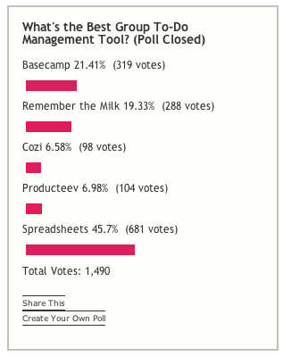
 You have to wonder how far development of business software has progressed, when spreadsheets is being voted as the the best tool for the simple task of a to-do list.
The new logo is our most controversial change. I love it, though that’s no accident: we went through many, many options with Code & Theory before finding one we liked. It’s bold, simple, and versatile. It works in any context — from a tiny monochrome icon to a mosaic on a poster. It fits the TechCrunch brand perfectly. And no, we didn’t build it in Minecraft. We used AOL Paint, which comes free on the AOL CD and has this sweet UltraLogoMatic2000 feature.
The overall look & feel reflects the bold, sometimes irreverent nature of TechCrunch. It doesn’t hold tea parties in the backyard or hang out with the black turtleneck crowd at the hippest art galleries. It’s a design that breaks more news than its competitors, that loves the code junkies working 22-hour days to build world-changing products. It’s the first and only design Heather, Mike and I looked at and said yeah, that’s it. It screams TechCrunch.
 I had a full article on the issue but the WordPress iPhone app decided to eat it, so here are some other people's articles instead

With the announcement yesterday about Facebook's Video chat feature, there is more interest surrounding ways that you can share the apps running on your screen as well as your mug across a video link. There are dozens of Web conferencing products that I have cataloged here and I will mention a few of these services that are completely free and can be used to set up a video link between at least two computers with a minimum of fuss and bother
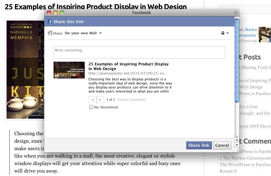
Choosing the best way to display products is a really important step of web design, since the way you display your products can drive attention to it and make users interested in what you are selling, or can drive users away. It’s like when you are walking in a mall, the most creative, elegant or stylish window displays will get your attention while super colorful and busy ones will drive you away.
Full article: 25 Examples of Inspiring Product Display in Web Design | Codrops
 You can make something work in theory, but reality can often have a different opinion. My plan to integrate WordPress with Facebook worked in theory (and the first tests) but in practice there were problems.
Facebook isn't necessarily the new Compuserve, and Google might not be angling to be the Hotel California of tech, but all of the big web giants seem intent on locking their users into experiencing a single-vendor web.
Facebook riled users this week by throttling their ability to export their Facebook friends' data for use with Google+ or other services, while Google dumped Twitter from its realtime search in favor of its own Google+. The web as an intersection of seemingly infinite networks threatens to become a limited patchwork of monopolized web experiences that only grudgingly talk with each other.

Today we’re making the first version of Swiffy available on Google Labs. You can upload a SWF file, and Swiffy will produce an HTML5 version which will run in modern browsers with a high level of SVG support such as Chrome and Safari. It’s still an early version, so it won’t convert all Flash content, but it already works well on ads and animations. We have some examples of converted SWF files if you want to see it in action.
Swiffy uses a compact JSON representation of the animation, which is rendered using SVG and a bit of HTML5 and CSS3. ActionScript 2.0 is also present in the JSON object, and is interpreted in JavaScript in the browser. This representation makes the Swiffy animations almost as compact as the original SWF files.
Forbes is reporting that Facebook’s Zuckerberg is now richer than the Google’s Sergey and Larry. How did that happen? By using the most naive form of financial extrapolation and calling it fact.
Here’s how the financial alchemy works: GSV Capital spent $6.5 million to buy 225,000 shares at ~$30/share. That amounts to buying about 0.01% of Facebook. They purchased these shares at a 40% premium over the last big valuation that put Facebook to be worth $50 billion.
So if you extrapolate that the premium paid for 0.01% of the company is the same premium someone else would pay for 100% of the company, you get that Facebook is now worth $70 billion.
The +1 button and the Google+ project are both about making it easier to connect with the people you trust online. For the +1 button, that means bringing advice from trusted friends and contacts right into Google search, letting the users who love your web content recommend it at the moment of decision.
But when you’re managing a website, it's usually not real until you can measure it. So we’re happy to say we’ve got one more announcement to make -- today we’re releasing reports that show you the value +1 buttons bring to your site.